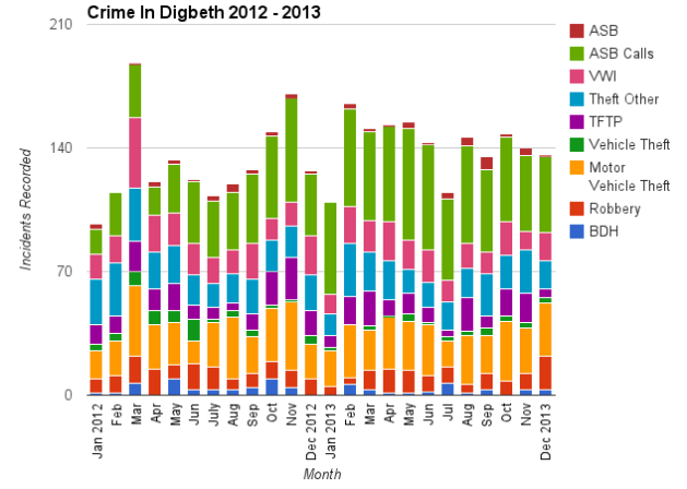
I have been attending the council meetings for the ward I live in. They seem more to be more a paper exercise than democracy in action. In some cases local residents have been outnumbered by council employees. One of the handouts we received was the crime statistics for local areas. The data itself is a table of numbers. No graph, charts or anything to make it easier to digest. So I decided to chart the data myself.
The stacked bars below show the total levels of recorded crime each month. Each bar is broken down into incident type. You can see that March 2012 experienced a spike in crime.
The chart below shows the types of recorded crime each month as a proportion of the total crime recorded in that month. This is essentially a percentage. It is as though there were 100 reported crimes each month. Each bar then breaks up this 100 into the different types of crime recorded. Each horizontal band represents a different crime. The wider the band gets the more crime of that type, and the narrower the band, the less it is.

